The cool thing about styling with CSS is that you don’t have to specify a style every time you create an element. You can just say "all paragraphs should have this particular styling" and you're good to go. Here's an example of how you might do that.
Let's say you want every paragraph (that's everything with a <p> HTML tag) on your page to be slightly larger than usual. And dark grey, instead of black. Here's how you would do that with CSS:
p {
font-size: 120%;
font-height:160%;
color: red;
}
p.smallcaps {
  font-variant: small-caps;
  text-transform: uppercase;
}

Note: Other values for Text-transform are uppercase / lowercase / capitalize.

<p> class="smallcaps">Your paragraph here.</p>
a:link {color: gray;}

a:visited {color: green;}

a:hover {color: rebeccapurple;}

a:active {color: teal;}
While underlined text pretty clearly indicates a link, it sometimes looks nicer to scrap that underline. This is accomplished with the “text-decoration” attribute. Here's how we'd get rid of underlines on links:
a {text-decoration: none;}
a:hover {text-decoration: underline;}
Anything with the link ("a") tag will remain un-underlined. Want to underline it when the user hovers over it? Just add this below:
You could also add this text-decoration to active links to make sure the underline doesn't disappear when the link is clicked.
If you want to attract more attention to your link, using a link button is a great way to go about it. This one requires a few more lines, but we'll go over them each individually:
a:link, a:visited, a:hover, a:active {
  background-color: green;
  color: white;
  padding: 10px 25px;
  text-align: center;
  text-decoration: none;
  display: inline-block;
}
By including all four link states, we ensure that the button doesn't disappear when a user hovers or clicks on it. You can also set different parameters for hover and active links, like changing the button or text color, to add a bit of pop.
The background color is set with background-color, and text color with color. Padding defines the size of box - the text is padded by 10px vertically and 25px horizontally. Text-align ensures that the text is displayed in the center of the button, instead of off to one side. Text-decoration, as we saw in the last example, removes the underline.
Result:
A plain paragraph isn't very exciting. If you want to highlight your call to action or another element on your page, you might want to throw a border around it. Here’s how to do that with a string of text:
p.important {
  border-style: solid;
  border-width: 5px;
  border-color: purple;
}

<p> class="important">Your important paragraph here.</p>
This one is pretty straightforward. It creates a solid purple border, 5 pixels wide, around any important-class paragraph. This will work regardless of the size of your paragraph; a single line will get a border the width of the page, one line high, and a longer paragraph will be surrounded by a larger border.
There are many different border styles you can apply; instead of "solid," try "dotted" or "double". And the width can be "thin", "medium" or "thick".
For a very common task, this is a surprisingly unintuitive thing to do with CSS. Once you’ve done it a few times though, it becomes much easier. There are a couple different ways to center things.
For a block element (usually an image), we'll use the margin attribute:
.center {
  display: block;
  margin: auto;
}
This ensures that the element is displayed as a block, and that the margin on each side is set automatically (which makes them equal). If you want to center all of the images on a given page, you can even add "margin: auto" to the img tag:
img {margin: auto;}
Example : 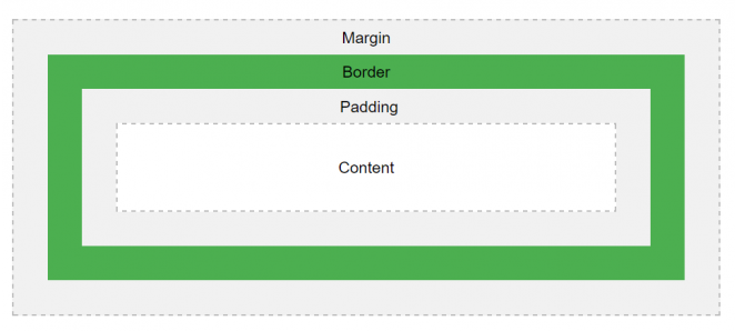
But what if we want to center text? CSS has a specific method of doing that:
.centertext {
  text-align: center;
}

<p> class="centertext">This text will be centered.</p>
The padding of an element specifies how much space should be on each side. For example, if you add 25 pixels of padding to the bottom of an image, the following text will be pushed 25 pixels down. Many elements can have padding, but we’ll use an image for an example here.
Let’s say you want every image to have 20 pixels of padding on the left and right sides, and 40 pixels on the top and bottom. There are a number of ways you can do this. The most basic:
img {
  padding-top: 40px;
  padding-right: 25px;
  padding-bottom: 40px;
  padding-left: 25px;
}
There's a short hand we can use to present all of this information:
img {
  padding: 40px 25px 40px 25px;
}
This sets the top, right, bottom, and left paddings to the right number. But we can make it even shorter:
img {padding: 40px 25px}
When you use only two values, the first value is set for the top and bottom, while the second will be left and right.
CSS can do a lot to make your tables look really nice. Adding colors, adjusting borders, and making your table responsive to mobile screens are all easy. We'll look at just one cool effect here: highlighting table rows when you mouse over them.
tr:hover {background-color: #ddd;}
Example : 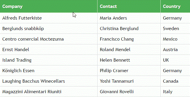
CSS can help you do cool things with images, too. For example, it can display images at less than full opacity (they appear slightly "whited out") and bring them to full opacity when you mouse over them. Here’s how we'll do that:
img {
  opacity: 0.5;
  filter: alpha(opacity=50);
}
The “filter” attribute does the same thing as “opacity,” but Internet Explorer 8 and earlier don’t recognize the opacity measurement, so it’s a good idea to include it.
Now that the images are slightly transparent, we’ll bring them to fully opaque on a mouseover:
img:hover {
  opacity: 1.0;
  filter: alpha(opacity=100);
}